
 EN



A brochure can do more than present information; its folds can shape the order in which potential clients encounter it. To guide readers effectively, plan the brochure as a sequence, matching each panel to a deliberate step in the conversation. Creative folding works when the physical reveal supports the message, not when an unusual format distracts from it. A well-planned brochure gives each idea a place and helps the reader move naturally toward a useful next step.
Start by deciding what a potential client should understand first, what deserves a closer look, and what action should follow. The brochure fold then becomes a navigation tool: it can introduce a problem, reveal a solution, and reserve a panel for proof or contact details. This approach keeps a brochure focused on reader needs while making the format part of the experience. The guidance below explains how to plan, choose, and refine those folds.
Plan the reader journey before choosing a fold
Give each panel a clear role
Map the reading journey before designing the brochure artwork. Decide which panel introduces the offer, which explains the value, and which supports the decision with specifications, examples, or next steps. This simple content map prevents a brochure from becoming a collection of disconnected blocks. It also makes the fold purposeful: each opening should reveal information at the moment a reader needs it.
Consider how the brochure will be held and opened, then identify the first visible panel. Put a concise promise or relevant question there, rather than a dense paragraph. Inside, use a logical progression from context to solution, and let the final panel carry practical details such as contact information. A brochure becomes easier to scan when every panel has one primary task and supporting content stays subordinate.
Match content depth to the reveal
A fold creates anticipation, so use that reveal to control information depth. The cover can establish relevance, while an inner panel expands on the issue and its implications. A further opening can present process details, product options, or evidence. This staged brochure structure helps readers absorb information in manageable portions rather than facing every claim at once.
Not every reader will open every panel. Keep essential context understandable at each stage, and avoid hiding a key qualification or call to action behind several folds. Repeated headings, clear panel labels, and consistent visual cues can preserve orientation. In a brochure for a technical service, for example, a concise benefit can lead into a workflow, with detailed requirements placed later for readers who want them.
Choose fold patterns that support the message
Use simple folds for direct progression
A half-fold or tri-fold suits a brochure with a straightforward narrative and a limited number of content themes. The panels can lead from introduction to explanation and then to response, giving readers a familiar route. A tri-fold also creates natural spaces for separate topics, but designers should check the panel order carefully so that the printed brochure reads correctly when opened.
A simple fold is not a reason to fill every surface. Preserve enough open space for headings, diagrams, and short paragraphs to work together. If the brochure has several technical points, group related details under clear labels rather than splitting one explanation across unrelated panels. The fold should make the story easier to follow; the layout should make each step easy to recognize.
Use progressive folds for discovery
A gatefold or accordion-style brochure can create a more deliberate sequence when the subject benefits from progressive discovery. A gatefold can frame a central reveal, such as a system overview or main proposition, while an accordion can present stages or connected options in order. Choose this approach only when the content genuinely gains meaning from the unfolding experience.
Before committing, sketch the brochure flat and label every panel with its intended message. Check the outside and inside reading order, including what appears when the piece is first picked up. A fold that looks compelling in a digital mockup may be confusing in hand if the cover, opening panels, or central reveal compete for attention. Prototype the brochure at actual size to assess handling and sequence.
Refine the design for clarity and production
Direct attention with visual hierarchy
Use typography, color, and imagery to signal where to begin and where to look next. A strong headline can anchor each panel, while a restrained color cue can distinguish stages in the brochure journey. Arrows and directional graphics may help, but should not substitute for sensible panel order. Readers should understand the sequence without needing instructions for how to read the brochure.
Make each panel work at its physical size. Body copy that appears comfortable on a large screen may feel cramped after folding, especially near creases. Keep key text away from fold lines and allow adequate margins for handling and finishing. Check that images, captions, and diagrams remain legible when the brochure is opened only partway, since readers often scan before fully unfolding a piece.
Proof the folded piece in real conditions
Review a printed dummy before approving production. Fold it by hand, follow the intended reading path, and ask someone unfamiliar with the content to identify the main message and next action. This practical test can reveal panels that appear in an unexpected order, text hidden in a crease, or a call to action that arrives too late. Adjust the brochure layout based on what readers actually notice.
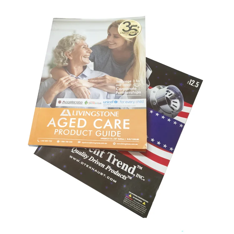
Also confirm paper choice, page dimensions, fold tolerances, and finishing requirements with the print team. A brochure design must accommodate the material and production method as well as the content plan. If a project needs booklet-style pages or a more extensive narrative, review a brochure format suited to that scope. Clear specifications and a final folded proof help ensure the finished piece follows the intended reader journey.
FAQ
How should a brochure guide readers through its panels?
Give the brochure a clear beginning, middle, and next step. Use the cover to establish relevance, inner panels to explain value and supporting detail, and a final panel for action or contact information. Keep the sequence visible through consistent headings and visual cues.
Which fold works best for a complex message?
The right brochure fold depends on how the information should unfold. A simple fold can handle a direct narrative, while a progressive fold may suit stages, options, or a central reveal. Sketch and test the panel order before choosing the format.
How can a folded brochure remain easy to read?
Keep copy concise, preserve space around creases, and establish a clear visual hierarchy. Review a physical brochure dummy at actual size and check whether readers can follow it without guidance. Confirm dimensions and finishing details before approving print production.