


Brand tone is not merely communicated through words and images—it extends deeply into the tactile and visual qualities of the physical materials you choose for your printed publications. When readers hold a magazine, catalog, or brochure, the magazine paper texture and binding method instantly convey messages about your brand's values, quality standards, and market positioning. A rough, uncoated surface might signal authenticity and environmental consciousness, while a smooth, glossy finish often suggests premium quality and modern sophistication. Similarly, binding choices—whether perfect bound, saddle-stitched, or case-bound—affect durability perceptions and user experience. Understanding how to strategically align these physical characteristics with your brand identity is essential for creating cohesive, memorable print materials that resonate with your target audience and differentiate your business in competitive B2B and consumer markets.
The relationship between magazine paper texture, binding quality, and brand tone operates on both conscious and subconscious levels, influencing how readers perceive credibility, attention to detail, and brand personality before they even engage with your content. In this comprehensive guide, we will explore the practical mechanisms through which paper selection and binding methods shape brand perception, examine the specific characteristics of different magazine paper textures and their psychological associations, and provide actionable frameworks for matching these physical attributes to your intended brand tone. Whether you are launching a luxury lifestyle publication, a technical industry catalog, or an eco-conscious brand magazine, mastering these material decisions will enhance your ability to communicate authentically and effectively through every physical touchpoint.
Understanding the Connection Between Physical Material Choices and Brand Identity
How Magazine Paper Texture Communicates Brand Values
The magazine paper texture you select functions as a silent brand ambassador, instantly conveying messages about quality, sustainability, and market positioning. Coated papers with smooth, glossy finishes reflect light uniformly and reproduce vibrant colors with high fidelity, making them ideal for brands emphasizing modernity, luxury, or visual impact. These surfaces suggest precision, professionalism, and investment in premium presentation. Conversely, uncoated papers with visible fiber textures and matte finishes absorb ink differently, creating softer color reproduction and a more organic, tactile experience. This magazine paper texture choice signals authenticity, environmental awareness, and a preference for substance over superficial gloss, resonating particularly well with brands in natural products, artisanal goods, or ethical business sectors.
Beyond the coated versus uncoated distinction, the weight and thickness of magazine paper texture influence perceptions of durability and value. Heavier stocks—typically ranging from 150gsm to 300gsm—feel substantial in hand and resist wear during repeated handling, suggesting permanence and investment in quality. Lighter papers, while more cost-effective and easier to mail, may inadvertently communicate budget constraints or disposability unless strategically positioned for environmental efficiency. The tactile feedback readers receive when turning pages becomes part of your brand experience: a crisp snap suggests freshness and quality control, while a softer, more flexible feel can evoke approachability and comfort. These physical sensations register subconsciously but powerfully, shaping overall brand perception alongside visual design elements.
The Role of Binding Methods in Brand Perception
Binding methods serve functional purposes—holding pages together—but simultaneously communicate important brand messages about longevity, usability, and attention to craftsmanship. Perfect binding, which uses adhesive to attach pages to a squared spine, creates a polished, book-like appearance that suggests professionalism and permanence. This method works exceptionally well for thicker publications and signals that your content deserves preservation and repeated reference. Saddle-stitch binding, which uses staples along the center fold, offers a more casual, accessible feel while remaining cost-effective for moderate page counts. This approach suits periodicals, newsletters, and publications intended for quick consumption rather than long-term retention.
Case binding—hardcover construction with sewn signatures—represents the premium tier of binding options, immediately elevating perceived value and suggesting that your publication contains reference-worthy content deserving protective treatment. When paired with appropriate magazine paper texture choices, case binding transforms catalogs and magazines into collectible objects that recipients are more likely to retain and display. Spiral and wire-o bindings, while functional for lay-flat usability in technical manuals or cookbooks, can appear less formal and may undermine luxury positioning unless deliberately chosen to emphasize practical utility as a brand value. The binding decision directly affects how long your publication remains in circulation and whether it ends up on a coffee table or in recycling, making it a critical component of your brand's physical presence.
Creating Multisensory Brand Experiences Through Material Selection
Effective brand tone definition requires thinking beyond visual design to embrace the full spectrum of sensory experiences your publication creates. The magazine paper texture interacts with lighting conditions in readers' environments, changing appearance throughout the day and in different settings. Glossy coated papers maintain consistent vibrancy regardless of lighting but can create glare under direct illumination, while matte and uncoated surfaces respond more subtly to ambient light, creating a softer, more intimate reading experience. These environmental interactions become part of your brand's physical personality, affecting when and where readers choose to engage with your content.
The weight distribution and balance of your bound publication also contribute to brand perception. A well-constructed magazine with appropriate magazine paper texture and professional binding lies flat when opened, making content easily accessible and signaling thoughtful design. Publications that spring closed or require constant hand pressure to keep open create frustration and suggest insufficient attention to user experience. Similarly, the sound of pages turning—the whisper of thin glossy sheets versus the substantial rustle of heavier uncoated stock—adds an auditory dimension to brand interaction. These multisensory details may seem minor individually, but collectively they create a cohesive brand experience that distinguishes your publication from competitors and reinforces your market positioning through every physical interaction.
Selecting Magazine Paper Texture to Match Specific Brand Tones
Luxury and Premium Brand Positioning
Brands seeking to convey luxury, exclusivity, and premium quality typically benefit from heavier coated papers with silk or gloss finishes that showcase photography and design elements with maximum visual impact. The magazine paper texture in this category—typically 170gsm to 250gsm coated art paper—provides substantial hand feel while maintaining the smooth surface necessary for vibrant color reproduction and sharp detail resolution. This combination of weight and finish immediately communicates investment in quality materials and suggests that the content within merits premium presentation. The reflective quality of glossy magazine paper texture enhances perceived color saturation and creates visual depth that draws readers into imagery, making it particularly effective for fashion, automotive, high-end hospitality, and luxury consumer goods sectors.
For brands where understated elegance matters more than overt shine, silk-coated or satin-finish magazine paper textures offer an sophisticated alternative that maintains excellent printability while reducing glare. These semi-gloss surfaces balance visual richness with tactile refinement, suggesting confidence rather than showiness. When combined with perfect binding or case binding featuring embossed or foil-stamped covers, these paper choices create publications that recipients perceive as valuable objects worth retaining. The physical heft and smooth magazine paper texture work together to slow down reading pace, encouraging more deliberate engagement with content—an ideal outcome for brands whose messaging benefits from contemplative consideration rather than quick scanning.
Authentic and Sustainability-Focused Brands
Brands emphasizing authenticity, environmental responsibility, or artisanal values typically align better with uncoated magazine paper textures that showcase natural fiber characteristics and matte finishes. These papers—often made from recycled content or sustainably sourced pulp—feature visible texture, slight color variation, and ink absorption qualities that create a more organic aesthetic. The tactile experience of uncoated magazine paper texture feels warmer and more approachable than glossy alternatives, inviting touch and conveying honesty through material transparency. This choice particularly resonates in sectors like organic food, eco-fashion, outdoor recreation, and social enterprise, where material authenticity reinforces brand messaging about values and practices.
The slightly rougher surface of uncoated magazine paper texture affects color reproduction, typically producing softer, more muted tones compared to coated papers. Rather than viewing this as a limitation, brands embracing this aesthetic can leverage it to create a distinctive visual signature that stands apart from the high-gloss competition. The natural variation in uncoated papers—subtle differences in color warmth and texture from sheet to sheet—reinforces messages about imperfection as authenticity rather than flaw. When paired with visible stitching in binding or natural-toned cover materials, these magazine paper texture choices create publications that feel crafted rather than manufactured, aligning physical presentation with brand narratives about care, consideration, and connection to materials and processes.
Modern, Tech-Forward, and Innovation-Oriented Brands
Brands positioning themselves at the intersection of technology, innovation, and forward-thinking design often benefit from crisp, bright white coated magazine paper textures with high smoothness ratings that enable precision in both photography and typography. These papers—typically in the 130gsm to 170gsm range for text pages—provide an ideal canvas for clean layouts, sharp typography, and high-contrast imagery that conveys clarity and precision. The uniform surface of premium coated magazine paper texture ensures consistent ink coverage and color matching across print runs, projecting the reliability and attention to detail that technical audiences expect from innovative brands.
For technology and design-focused brands, the magazine paper texture choice often emphasizes thinness and lightness without sacrificing opacity or print quality, reflecting values of efficiency and optimization. High-quality lightweight coated papers maintain excellent print fidelity while reducing overall publication weight and bulk, creating a streamlined physical presence that mirrors the brand's approach to problem-solving. When combined with modern binding techniques like perfect binding with printed spines that clearly identify content, these material choices create publications that function as practical reference tools while maintaining aesthetic sophistication. The bright white base of premium coated magazine paper texture also maximizes screen-to-print color matching accuracy, crucial for brands whose digital and physical presences must maintain visual consistency.
Binding Method Selection as Brand Tone Definition
Perfect Binding for Professional Authority
Perfect binding creates a squared spine that allows for printed identification, making publications easily retrievable from shelves and signaling content substantial enough to warrant organized storage. This binding method works optimally with page counts above 40 pages and pairs naturally with magazine paper texture selections in the medium to heavy weight range. The clean, uniform appearance of perfect-bound publications conveys organizational competence and editorial professionalism, making this binding choice particularly effective for corporate capabilities brochures, annual reports, academic journals, and industry reference catalogs where authority and credibility matter most.
The permanence suggested by perfect binding influences how recipients treat your publication—they are more likely to file it, display it, or refer back to it rather than disposing of it after initial reading. This extended lifespan amplifies your brand's presence in the physical environment and increases opportunities for repeated exposure to your messaging. When combined with appropriate magazine paper texture that resists wear and maintains appearance over time, perfect binding transforms marketing materials into reference resources that continue delivering brand value long after distribution. The squared spine also enables stacking without damage, making perfect-bound publications practical for trade show distribution where durability during transport and handling becomes essential.
Saddle-Stitch Binding for Approachability and Frequency
Saddle-stitch binding, utilizing staples along the center fold, creates publications that open completely flat and offer an informal, accessible reading experience. This method works best for page counts between 8 and 64 pages and pairs effectively with lighter to medium-weight magazine paper textures that remain flexible without excessive bulk at the spine. The casual nature of saddle-stitched publications suggests approachability and frequent communication rather than formal documentation, making this binding choice appropriate for newsletters, event programs, quarterly updates, and promotional magazines where regular issuance matters more than archival permanence.
The cost-effectiveness of saddle-stitch binding enables higher-frequency publication schedules, supporting brand strategies that emphasize ongoing engagement and fresh content delivery. This binding method signals that your brand prioritizes consistent communication and timely information over rarified, exclusive messaging. When paired with appropriate magazine paper texture selections that balance quality with practical economics, saddle-stitched publications can maintain premium feel while supporting sustainable distribution frequencies. The lay-flat functionality also enhances usability for instructional content, recipes, and step-by-step guides where readers need hands-free reference capability, making binding choice a functional extension of brand utility and service orientation.
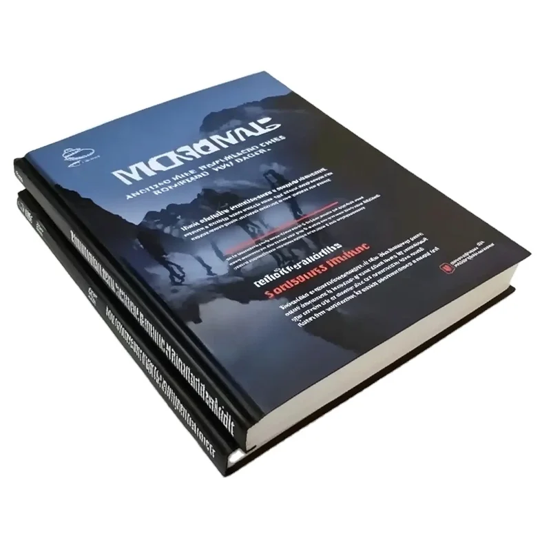
Case Binding for Heritage and Premium Positioning
Case binding—hardcover construction with sewn page signatures—represents the pinnacle of publication craftsmanship and immediately elevates perceived value to collectible status. This binding method pairs with premium magazine paper texture selections to create publications that recipients perceive as books rather than ephemeral marketing materials. The rigid covers protect contents during handling and storage while providing surfaces for embossing, debossing, foil stamping, and other decorative techniques that further enhance perceived luxury. Case-bound publications signal that your brand views its content as enduring rather than disposable, appropriate for anniversary publications, limited-edition brand books, comprehensive product portfolios, and corporate history volumes.
The substantial investment required for case binding becomes part of the brand message itself, demonstrating commitment to quality and willingness to allocate resources toward excellent presentation. This binding choice works particularly well for brands with heritage narratives, craftsmanship positioning, or luxury market segments where material quality serves as proof of broader brand promises. When combined with high-quality magazine paper texture—often uncoated stocks with substantial weight and distinctive finish—case binding creates multisensory brand experiences that engage recipients emotionally and cognitively. The permanence of hardcover construction also supports sustainability messaging by creating publications designed for longevity rather than single-use disposal, aligning physical product lifecycle with environmental brand values.
Implementing Coordinated Material Strategies for Cohesive Brand Expression
Aligning Paper and Binding Choices with Visual Brand Identity
Effective brand tone definition through magazine paper texture and binding requires coordination with your broader visual identity system, including color palettes, typography, photography style, and graphic design approach. Glossy coated papers intensify color saturation and work best with bold, vibrant color schemes and high-contrast photography, while uncoated magazine paper textures soften colors and suit earth-toned palettes and illustration-heavy designs. The physical characteristics of your chosen magazine paper texture should amplify rather than compete with your visual design strategy, creating unified sensory experiences where material and message reinforce each other.
Typography selection must also account for magazine paper texture characteristics, as ink absorption and dot gain vary significantly between coated and uncoated surfaces. Fine serif typefaces and delicate line work reproduce with greater fidelity on smooth coated papers, while bolder sans-serif fonts maintain legibility and impact on textured uncoated stocks. Similarly, binding methods affect margin requirements and layout possibilities—perfect-bound publications need sufficient inner margins to prevent text disappearing into the gutter, while saddle-stitched publications can utilize center spreads more effectively. These technical considerations become strategic brand tone decisions when approached as integrated components of your publication's overall communication effectiveness rather than isolated production specifications.
Budget Allocation and Value Perception Management
Strategic selection of magazine paper texture and binding methods enables budget optimization while maintaining appropriate brand tone. Rather than uniformly specifying premium materials throughout, consider differentiated approaches where cover stock quality exceeds interior pages, or where select signature sections use upgraded magazine paper texture to highlight priority content. This layered strategy allows budget concentration on highest-impact touchpoints while maintaining overall publication quality. For instance, a catalog might use premium coated magazine paper texture for product photography sections while employing lighter uncoated stock for technical specifications, creating both visual variety and functional differentiation.
Understanding the relationship between material investment and perceived value helps optimize budget allocation for maximum brand impact. Modest increases in magazine paper texture weight or binding quality often produce disproportionately large improvements in recipient perception, while excessive specification beyond what target audiences notice represents inefficient resource allocation. Testing different material combinations with representative audience segments provides empirical evidence for decision-making, revealing which physical characteristics actually influence brand perception versus those that remain unnoticed. This data-driven approach to magazine paper texture and binding selection ensures that material investments directly support strategic brand positioning rather than simply following production conventions or competitor precedents.
Consistency Across Publication Portfolio
Maintaining consistent magazine paper texture and binding standards across your publication portfolio reinforces brand recognition and signals organizational coherence. Establishing clear material specifications for different publication categories—product catalogs, corporate brochures, customer magazines, technical documentation—creates predictable brand experiences while allowing appropriate variation based on content type and audience needs. This systematized approach to magazine paper texture selection builds familiarity over time, enabling recipients to instantly recognize your publications by physical feel before even seeing branding elements.
Documentation of material standards should extend beyond simple specifications to include rationale connecting choices to brand strategy, enabling consistent decision-making as personnel change and publication needs evolve. Recording which magazine paper textures support which brand messages, and which binding methods align with which content types, creates institutional knowledge that preserves brand integrity across multiple production cycles and various stakeholders. This strategic approach transforms what might otherwise be viewed as technical production details into purposeful brand-building tools that operate consistently across all physical touchpoints, strengthening overall brand coherence and market differentiation.
Practical Implementation Considerations and Quality Control
Testing and Prototyping Before Full Production
Before committing to full production runs, creating physical prototypes using your selected magazine paper texture and binding methods reveals how design translates to finished product and enables refinement before significant investment. Prototype testing should include representatives from your target audience who can provide feedback on tactile experience, usability, and overall impression. This validation process often reveals unexpected interactions between paper characteristics and design elements—such as show-through on lighter stocks, glare issues with highly reflective surfaces, or binding stiffness affecting page-turning experience—that require adjustment for optimal results.
Prototyping also enables direct comparison of alternative magazine paper texture options under realistic conditions, including varied lighting environments and extended handling. What appears acceptable in specification sheets or single-sheet samples may perform differently when assembled into complete publications with your specific ink coverage, image density, and page count. Testing binding durability through repeated opening and closing simulates real-world usage and reveals whether your specifications will maintain appearance and functionality throughout the publication's intended lifespan. This investment in pre-production validation prevents costly errors and ensures that finished publications accurately embody your intended brand tone.
Vendor Selection and Quality Partnership
Choosing production partners with expertise in the specific magazine paper textures and binding methods central to your brand strategy ensures consistent quality and enables collaborative problem-solving when challenges arise. Experienced vendors can recommend appropriate materials for your specific designs, alert you to potential production issues before they occur, and suggest cost-effective alternatives that maintain brand standards. Establishing long-term relationships with knowledgeable suppliers creates consistency in material sourcing and production quality, reducing variables that might otherwise introduce unwanted variation in magazine paper texture or binding execution.
Quality partnership extends beyond transactional vendor relationships to include shared understanding of your brand standards and collaborative optimization of specifications over time. Vendors invested in your success will proactively suggest improvements in magazine paper texture selection or binding techniques as new materials and methods become available, enabling continuous enhancement of your publications' competitive advantage. Regular communication about upcoming projects allows vendors to anticipate material requirements and production schedules, reducing rush charges and ensuring availability of specified stocks. This strategic approach to vendor management transforms production partners into brand-building collaborators who understand how physical materials contribute to your market positioning and business objectives.
Environmental Impact and Sustainability Alignment
Magazine paper texture and binding choices directly affect environmental footprint through material sourcing, production energy consumption, and end-of-life recyclability. Brands with sustainability commitments should prioritize papers with recycled content, FSC or PEFC certification, or alternative fiber sources that reduce environmental impact. Uncoated magazine paper textures typically require less chemical processing than heavily coated alternatives and often incorporate higher recycled content percentages while maintaining acceptable print quality. These material choices support environmental messaging through substance rather than claims alone, enabling your physical publications to demonstrate rather than merely assert sustainability values.
Binding methods similarly affect recyclability, with saddle-stitch staples generally easier to separate during recycling than perfect-bound adhesives. Specifying eco-friendly adhesives for perfect binding or case binding maintains premium presentation while improving recyclability. Documenting the environmental attributes of your magazine paper texture and binding specifications—including carbon footprint data, renewable energy usage in production, and disposal/recycling instructions—enables transparent communication with environmentally conscious audiences who increasingly evaluate brands based on comprehensive sustainability performance. This integration of environmental considerations into material selection demonstrates brand integrity and supports market differentiation in sectors where sustainability leadership creates competitive advantage.
FAQ
What is the most significant difference between coated and uncoated magazine paper texture for brand perception?
Coated magazine paper texture, with its smooth surface and reflective finish, conveys modernity, precision, and premium quality through vibrant color reproduction and sharp image detail. This surface treatment suggests investment in presentation and works well for brands emphasizing visual impact and contemporary sophistication. Uncoated magazine paper texture, featuring visible fiber structure and matte finish, communicates authenticity, warmth, and environmental consciousness through its organic tactile qualities and softer aesthetic. The uncoated surface absorbs ink differently, creating more subdued colors that many brands leverage to project approachability and substance over superficial polish. The choice between these magazine paper textures fundamentally shapes initial brand impressions and should align with your core brand values and target audience preferences.
How does binding method selection affect the longevity and perceived value of branded publications?
Binding method directly influences both physical durability and psychological perception of publication value. Perfect binding creates book-like permanence with squared spines that enable shelf storage and repeated reference, encouraging recipients to retain publications longer and treat them as valuable resources rather than disposable marketing materials. Saddle-stitch binding, while more economical and suited to thinner publications, suggests periodical or newsletter format intended for shorter-term relevance and more casual engagement. Case binding—hardcover construction—immediately elevates perceived value to premium or collectible status, signaling that content merits protective treatment and long-term preservation. The binding choice should match your strategic intent for publication lifespan and align with the message about content value you wish to communicate through physical construction quality.
Can budget-conscious brands still achieve strong brand tone through strategic magazine paper texture selection?
Budget limitations need not prevent effective brand tone communication through magazine paper texture when approached strategically. Rather than uniformly specifying premium materials, focus investment on highest-impact elements such as covers and key content sections while using more economical magazine paper texture for supplementary pages. Many uncoated papers in moderate weight ranges deliver excellent brand tone at lower cost than heavily coated alternatives while supporting authenticity and sustainability messaging. Additionally, optimizing design for your selected magazine paper texture—choosing appropriate color palettes, typography, and image treatments that work with rather than against paper characteristics—maximizes impact regardless of budget. Testing multiple material combinations within budget parameters often reveals cost-effective options that successfully convey intended brand tone without requiring premium specifications throughout.
What magazine paper texture and binding combination works best for publications requiring frequent updates or regular issuance?
Publications requiring frequent updates or regular issuance typically benefit from saddle-stitch binding combined with lighter to medium-weight magazine paper textures that balance quality with production efficiency and cost management. This combination enables economical production at higher frequencies while maintaining professional appearance and adequate durability for the shorter lifespan typical of periodical content. The magazine paper texture should provide sufficient opacity to prevent show-through while remaining lightweight enough to control postage costs if mailed. Coated papers in the 115gsm to 150gsm range offer good print quality and reasonable durability without excessive weight, while uncoated alternatives in similar weight ranges work well for brands prioritizing tactile warmth over high-gloss finish. The key is balancing material quality with the practical economics of sustainable publication frequency that supports ongoing brand engagement.
Table of Contents
- Understanding the Connection Between Physical Material Choices and Brand Identity
- Selecting Magazine Paper Texture to Match Specific Brand Tones
- Binding Method Selection as Brand Tone Definition
- Implementing Coordinated Material Strategies for Cohesive Brand Expression
- Practical Implementation Considerations and Quality Control
-
FAQ
- What is the most significant difference between coated and uncoated magazine paper texture for brand perception?
- How does binding method selection affect the longevity and perceived value of branded publications?
- Can budget-conscious brands still achieve strong brand tone through strategic magazine paper texture selection?
- What magazine paper texture and binding combination works best for publications requiring frequent updates or regular issuance?