
 EN



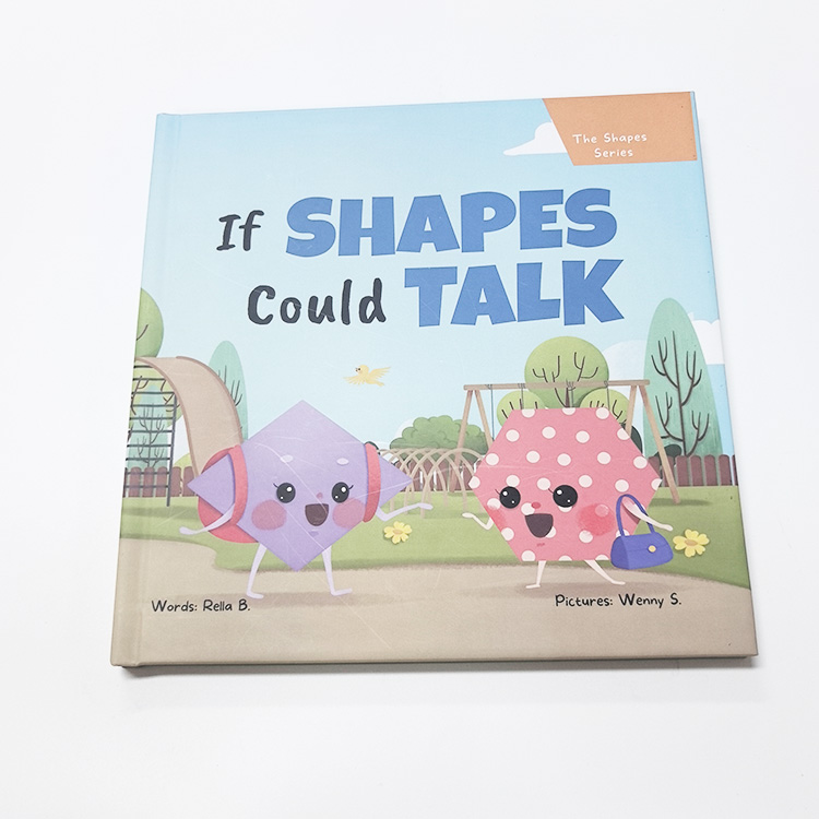
A reader forms an impression of a printed brochure before studying its message. Light, texture, color, and the feel of the paper all influence whether the brochure seems refined, practical, creative, or dependable. Choosing a surface finish deliberately helps align that first response with the purpose of the brochure and the expectations of its audience.
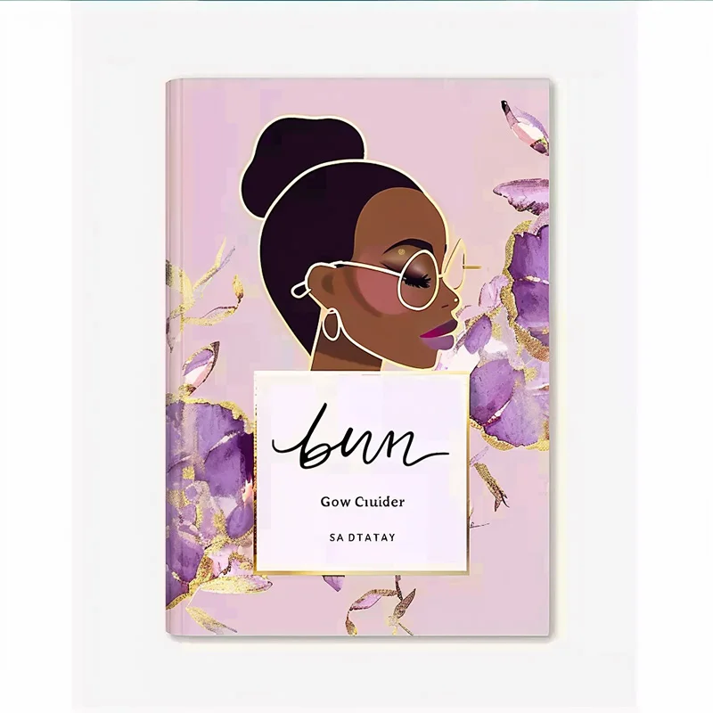
A finish is not simply a decorative extra. It affects how a brochure catches light, feels in the hand, and holds up during distribution, so the choice shapes both perception and use. When planning a brochure, consider the setting, audience, and message together; the right surface helps the brochure make a coherent first impression instead of sending mixed signals.
How surface finishes shape visual response
Gloss creates brightness and visual energy
Gloss coatings reflect more light, making photographs and saturated colors appear vivid. For a brochure featuring products, interiors, or detailed imagery, that brightness can invite a closer look and give the brochure an energetic character. The effect is most useful when visual impact matters, though strong reflections may compete with small text under direct lighting.
A glossy brochure can suggest polish and contemporary presentation, but the impression depends on the design beneath the coating. Dense color and high-contrast images often benefit from the reflective surface, while restrained layouts may feel more balanced with less shine. Check a physical brochure sample under the lighting where people will handle it, rather than judging gloss only on a screen.
Matte surfaces signal restraint and clarity
Matte finishes diffuse light instead of reflecting it sharply, producing a quieter, less reflective appearance. This can help a brochure feel understated and make text easier to view in bright spaces. A matte brochure is often a sensible direction for technical information, professional services, or brands that want a composed visual tone rather than an attention-grabbing sheen.
The softer surface can also change how colors appear: they may look less luminous than on gloss stock. That does not make matte a lesser choice; it means artwork and expectations should be considered together. Review proofs for a brochure with important dark tones, fine details, or subtle color differences, because these elements can read differently after finishing.
How touch and finish communicate quality
Texture adds a tactile layer to the message
An uncoated or textured surface gives a brochure a distinct feel that readers notice as soon as they pick it up. A subtle paper grain may suggest craft, warmth, or natural materials, helping a brochure stand apart from smooth promotional pieces. Texture works best when it supports the subject and visual identity, rather than distracting from the information.
Tactile choices also affect practical handling. A brochure passed between sales teams, displayed at an event, or kept for reference should feel comfortable to hold and easy to open. Ask how the chosen stock and finish behave with the planned folds and ink coverage. A textured brochure can be memorable, but the surface should not make essential text or imagery harder to read.
Special finishes make selected details stand out
Spot gloss, foil, embossing, and other specialty treatments draw attention to specific design elements rather than covering every panel. Used selectively, a brochure can direct the eye toward a logo, title, or product detail and create contrast between smooth and tactile areas. The strongest result usually comes from a clear hierarchy, with the finish reinforcing the message instead of competing with it.
Special treatments influence both appearance and production planning. They may require extra setup, suitable artwork, and careful positioning, so discuss feasibility before finalizing the layout. For a brochure with fine lines or small lettering, confirm that the intended effect will remain legible at the finished size. A sample or proof can help teams assess the actual contrast and touch.
Choosing a finish for the brochure’s purpose
Match the surface to audience and setting
Start by considering where the brochure will be seen and who will handle it. A handout used at a busy exhibition may need vivid imagery and a durable feel, while a brochure used in a client meeting may benefit from a more restrained surface. For materials placed under bright lights, assess reflections; for takeaway pieces, consider how the finish feels during repeated handling.
The intended message provides another useful guide. A brochure introducing a creative concept can use tactile contrast to make exploration part of the experience, whereas a brochure explaining specifications should prioritize readable text and clear diagrams. Align the surface with the tone of the copy, photography, and brand system. This coherence helps readers understand the offer before they reach the finer details.
Balance appearance, readability, and production needs
Review finish choices alongside paper weight, folds, binding, ink coverage, and budget. A surface that looks appealing in isolation may not suit a complex brochure layout or the way the piece will be distributed. Confirm that folds remain clean, important content avoids awkward glare, and any specialty treatment fits the production schedule and approved artwork.
Use a physical proof whenever the first impression is important to the decision. Compare how a brochure looks at arm’s length and close up, then turn pages under realistic lighting. Invite colleagues who represent the intended audience to handle it without coaching. Their responses can reveal whether the brochure feels appropriate, whether the finish supports the message, and whether the design remains comfortable to read.
A useful review is specific rather than simply asking whether the brochure looks attractive. Ask what the surface suggests, which element first catches attention, and whether the finish makes the brochure easier or harder to use. If the responses conflict with the intended positioning, adjust the coating, texture, or emphasis before production. For a reference to different printed catalogue and brochure options, see brochure formats and finishes.
FAQ
Which brochure finish is easiest to read?
Matte surfaces usually create fewer reflections, which can make a brochure more comfortable to read in bright conditions. Still, paper, lighting, font size, and layout matter too. Review the finished brochure in its intended setting before making a final choice.
Does gloss always make a brochure look more premium?
No. Gloss can give a brochure vivid color and shine, but premium perception depends on the design, paper, and audience. A restrained matte or textured brochure may better express quality when that surface fits the message and feels considered.
When should a team request a physical finish proof?
Request a proof when finish, color, readability, or tactile feel could affect approval. A physical brochure lets reviewers assess glare, texture, folds, and treatment placement in context. It is especially helpful before committing to a large or time-sensitive print run.